
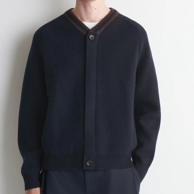
The same motif can look different on cropped and long styles or across sizes. Alongside artwork, identify essential elements, repeat scale, starting position and front/back relationships. These six visual routes help establish what to agree first and connect the design with garment structure, yarn shades and swatches.
Solids: let surface and outline lead
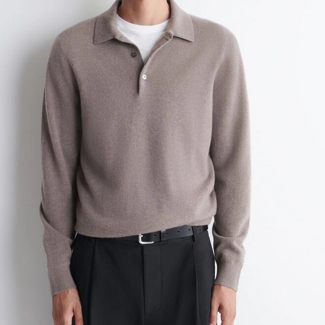
A solid colour gives more attention to neckline, shoulder, surface and hem. The white underlayer in this grey polo reference is styling, not a colour-blocked panel. Compare colour across the whole garment and on a small card, then agree review conditions under the relevant lighting.
- What to check in the sample
- Review within-lot consistency, colour near seams and appearance under agreed lighting.
A useful way to brief the factoryKeep the sweater solid and match the approved body colour; identify the underlayer separately.
USE THIS IN A STYLE BRIEFA solid style still needs a physical colour reference and viewing conditions. If texture is central, compare the colour in the proposed stitch on the same swatch.
Stripes: width, spacing and starting point
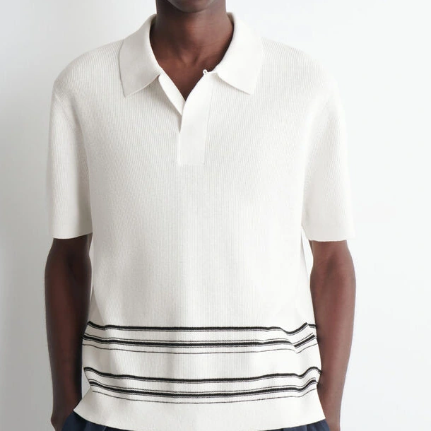
Narrow and broad stripes create different rhythms, while placement changes the emphasis. This pale polo concentrates its stripes lower on the body, leaving a quieter upper area. Specify widths, spacing and first-stripe position, and whether sleeves echo the body. Assess the knitting method separately from the graphic choice.
- What to check in the sample
- Check sleeve starting points, side alignment and stripe endings at neck and hem.
A useful way to brief the factoryKeep the fine-stripe rhythm and specify widths and repeat spacing in millimetres.
USE THIS IN A STYLE BRIEFMark where the first stripe begins and how body and sleeves relate. Identify alignment priorities before reviewing layouts across sizes.
Colour blocks: relate areas to the shape
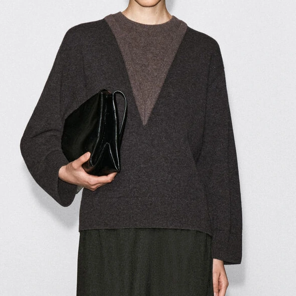
Colour areas can sit on shoulders, sleeves or the upper chest. This layered style uses contrasting V-shaped areas as its focal point. Establish the boundary, thickness and relationship between layers before choosing an integrated knit, layered arrangement or another method. The photo alone does not determine the construction.
- What to check in the sample
- Check boundaries, join handle, left/right consistency and colour transfer after care.
A useful way to brief the factoryPlace the blocks along the shoulder/sleeve division and assess joins and colour interaction.
USE THIS IN A STYLE BRIEFMark colour boundaries on the style drawing and say whether they should follow shoulders, placket or side seams. Discuss placement together with garment structure.
Argyle: diamond scale and diagonal lines
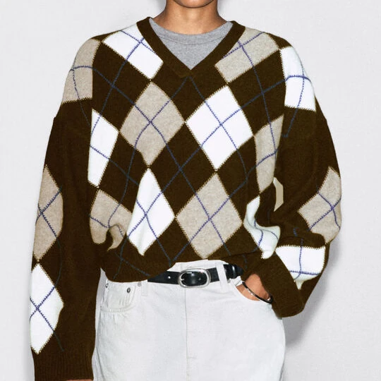
Argyle combines diamond areas with, in many versions, additional diagonal lines. The large diamonds and fine blue lines show a clear graphic hierarchy. Decide how many complete diamonds should span the body before resolving the neckline, sides and sleeves. Assess the fine-line construction separately instead of inferring it from the motif name.
- What to check in the sample
- Review diamond proportions, line definition, edge cropping and placement by size.
A useful way to brief the factoryRetain the hierarchy of large diamonds and fine diagonals; sample a complete repeat first.
USE THIS IN A STYLE BRIEFAgree diamond scale, repeat count and key placement before assessing construction. State which visual proportions should survive changes in size.
Fair Isle: organise the repeat
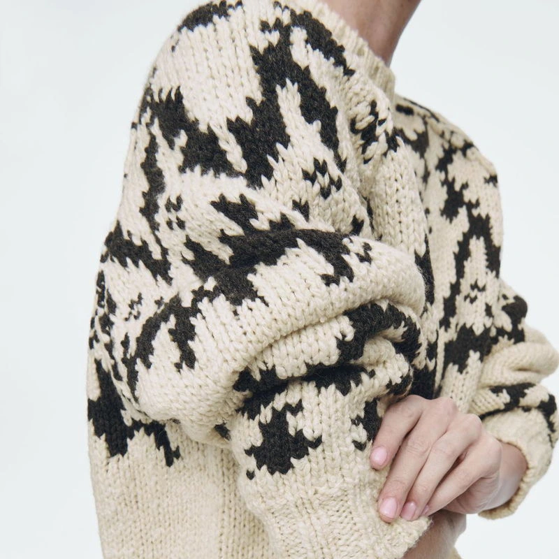
Fair Isle-style designs use repeated colour motifs to create rhythm. This shoulder-and-sleeve close-up helps compare contrasting motifs, stitch scale and repetition. Decide coverage before discussing colours per row, repeat size and the reverse construction. All-over pattern and local bands require different placement decisions.
- What to check in the sample
- Check band placement, repeat continuity, reverse comfort and snagging during access.
A useful way to brief the factoryConcentrate the motifs across the upper chest and specify the band height as a measurement.
USE THIS IN A STYLE BRIEFIdentify motif units that must remain complete and their priority areas on chest, shoulder or hem. Agree layout and reverse-side requirements separately.
Two-tone effects: texture close up, colour from afar
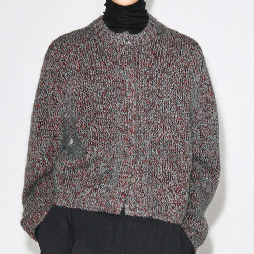
A two-tone or mixed-colour surface creates small-scale colour variation without treating every fleck as a separate motif. The source describes this cardigan as a brushed two-tone knit. Compare the close-up surface and the overall colour seen from a normal viewing distance; an enlarged phone image is insufficient as the sole colour reference.
- What to check in the sample
- Review overall tone, fleck density, halo and lot consistency.
A useful way to brief the factoryWe want a subtle mixed-colour effect; retain the approved yarn and garment colour references.
USE THIS IN A STYLE BRIEFReview marl effects close up, at a distance and under intended lighting. Use physical yarn or swatch references to reduce reliance on screen colour.
Turn the reference into a clear brief.
| Graphic direction | Artwork information | Construction review |
|---|---|---|
| Stripes | Width, spacing, start | Colour changes and alignment |
| Colour blocks | Dimensions, boundary, shape | Joins and reverse |
| Argyle | Full repeat and fine lines | Detail feasibility |
| Fair Isle | Coverage, repeat, colours/row | Reverse, weight and stretch |
Four steps for sample review
- Specify motif size in physical units rather than pixels alone.
- Identify elements that must remain complete and where cropping is acceptable.
- Check front, back, sleeves and size-to-size relationships.
- Approve a full-repeat swatch before the complete garment.
Common questions
Is every argyle design intarsia?
No. Argyle names the motif; construction depends on yarn routing, reverse and production plan.
Can the same artwork go unchanged across sizes?
Decide whether scale, repeat count or placement takes priority; they cannot always all stay unchanged.
Can I discuss a motif before preparing usable artwork?
Begin with the elements, colour relationships and placement you want. Before detailed development, agree usable artwork, scale and shades, including permission to use any brand marks or third-party designs.
Turn the graphic intent into artwork and swatch decisions
Identify what must remain and what may change in the graphic. These priorities help preserve the design intent while construction options are assessed.
- Provide artwork and a style drawing with repeat scale, body/sleeve layouts, essential elements and intended sizes.
- Agree shades with physical references, then compare swatch face/reverse, boundaries and any lettering in the proposed construction.
- Review placement, seams and size changes in the garment and record any acceptable repeat or positioning adjustments.
Bring the motif and its essential features
Share the style drawing, available artwork, intended sizes and physical colour references. Mark elements that must remain complete and positions or proportions that can be adjusted.
Discuss a motif and colour brief ↗Technical references
Confirm construction and performance with agreed samples and appropriate testing. The following references provide further reading.
- STOLL · Jacquard in Connection with Intarsia
- SHIMA SEIKI · Gauge / Fine Gauge / Intarsia Glossary
Product photographs are design references, not a claim about DALANG project work.
A customer brief: specify the artwork and how it will be made
A customer requested an original graphic placed on the front of a knit garment, with a smaller text detail on the back, and asked whether the artwork could be knitted in. Before choosing a technique, define the artwork files, scale, placement and intended colours, then review the proposed structure. The enquiry alone does not establish that the design or method was approved.